REVELSTOKE REBRANDS, AND WE LOVE THE LOOK!
On January 30th, with eager Revelstoke business owners and members of the community in attendance, Tourism Revelstoke unveiled their newest brand identity.

Going back in history and playing on the railway heritage of our community and region, the logo, well more like a wordmark, features the word ‘Revelstoke’ in the classic, hand crafted font found on the old railway sign that hung from the side of the Revelstoke Railway Station. Installed sometime following the 1880’s when the Canadian Pacific Railway was built through the area. In fact this sign is seen in the archived image above, of the station as far back as 1915.
Image: Revelstoke Museum and Archives
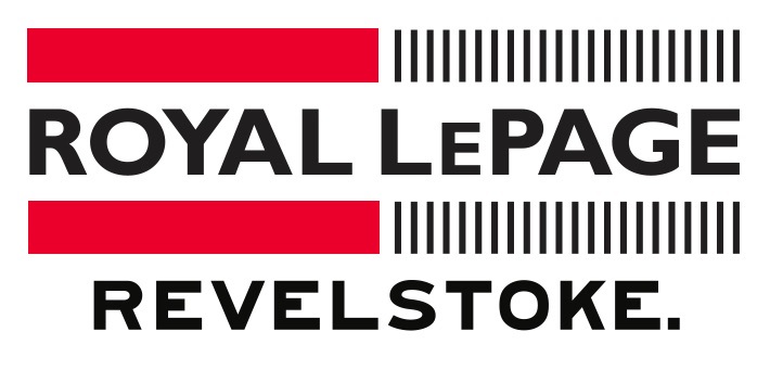
And we love it. Love it so much, that Royal Lepage Revelstoke is pleased to unveil our refreshed logo. Now incorporating the new Revelstoke logo into the Royal LePage logo, partnering our business with our community brand is exciting and refreshing.
Why the mysterious punctuation, the full stop? Who knows? Maybe it was the Signals Department sending a Western Union telegram from the Revelstoke Station that looked something like this:
PLEASE PREPARE SIGN FOR OUR STATION.
REVELSTOKE.
But, that’s for the Revelstoke Museum and Archives to discover. In the meantime, we like Tourism Revelstoke’s interpretation of this mark and how it suits the characteristics of the community. Playful, industrious and confident.
Congratulations Tourism Revelstoke for the great work and ‘hitting the mark’. And for the co-branding opportunity allowing us to share the new Revelstoke mark with our real estate community.
For more background on the process and background on the new mark, read Tourism Revelstoke’s media release here.
Or, click below to read more about the unveiling as profiled by The Mountaineer on January 30th, 2019.